
SIMPLE IOT - UX ENHANCEMENT FOR IOT AUTOMATION
Dec 2020 - Jan 2021 (5 weeks)
Internship, UI/UX
Designed by: Lin Tsai Wei
Project by: NUS Information Technology (NUS IT)
Supervised by: Amy Low (IT Architect)
PROJECT BACKGROUND
BEFORE SIMPLE IOT
Previously, NUS researchers who needed to connect their research equipment to the NUS network had to send email requests to the NUT IT Network Team. The Network Team will then manually register these Internet of Things (IoT) devices, which can count up to the hundreds, to grant them access. The entire process can take a few days and a lot of manpower.
HOW I CAME ON BOARD
The software team developed Simple IoT in summer 2020. The vision was to create a web-based application that will enable these NUS researchers to easily self-register their devices for network access. It enables users to instantly add, edit and delete their devices from the network, eliminating the waiting time before they can begin their research and reducing the workload of the Network Team.
The application was functionally ready. However, the user interface was difficult to navigate and not user-friendly. Therefore, a UX designer (me!) was brought on board to redesign the application to be more consistent and intuitive.
ORIGINAL USER INTERFACE
The homepage shows a list of registered devices by the user's research group. They can also switch between research groups, search for specific devices and delete or edit them

Clicking on the edit device button brings users to a new page (left).
Users are able to upload a csv file containing device information to register a large number of devices at one go.


A new device type has to be registered and approved before any devices of that type can be added.


RESEARCH
USER AND STAKEHOLDER INTERVIEWS
I spoke to an NUS researcher through Zoom to understand their current process of registering their devices for their research and some pain points they face. I also consulted a member of the Network Team on multiple occasions to learn about the backend processes and technical limitations.
KEY INSIGHTS
1. Each research project can require a number of devices, ranging from tens to hundreds, often of the same device types. There is rarely a need to edit device information.
2. The research team often has to send in their list of devices two to three weeks before the start of the project to ensure enough time for the Network Team to register all their devices.
3. Interaction with Network Team often ends after devices are registered. Issues such as the inability to connect to the network may occur and users often try to find alternate solutions or methods themselves, instead of contacting the Network Team as it is inconvenient.
USABILITY TESTING
INITIAL REDESIGN
I took 3 days to do a quick redesign while conducting user and stakeholder interviews. This was followed by 3 days of repeated discussions with the developers and refinement of the design, as well as preparation for usability testing.
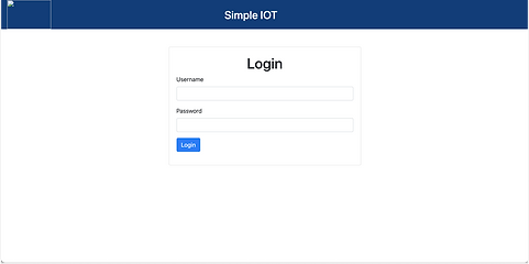
For the Login screen, I added access to FAQ and a button to request access for new unregistered users.
Additional information is included in the Registered Devices page, such as "date added" and "added by", to facilitate coordination in a research team. I also included colour-coding of information for more intuitive use.


New devices can now be added on the same page, instead of navigating to a new screen.
Editing of items appears as a pop-up instead of redirecting to another page. Editing multiple devices is also allowed.
.png)
.png)
Uses can now view existing device types and device types pending approval. Multi-add is also enabled.
FAQ can now be accessed while both logged in and out. There is also a function to send enquiries directly to the Network Team.


HIGH-FIDELITY MODERATED TESTING
I conducted two in-person usability tests and one over Zoom, along with the two developers who acted as observers. Due to the tight schedule of this 5-week project, we were unable to source for actual users of the application. Instead, we invited testers who were office staff familiar with technology and had some understanding of the context of use of the application.
The testers were given a series of scenarios with tasks that they had to complete. There was also a short interview and feedback session at the end. These are some examples of the tasks.


COMMON OBSERVATIONS

1. Confusion between drop-down navigation options of "All Device Types" and "Add Device Types"
2. Testers did not notice the tabs to switch between groups. Focus often on the left side of the screen.
3. Testers did not notice when a new fill-in option appeared when "Others" was selected. Line of sight goes from left to right.
4. Mistook the orange button as an option to add an additional device, rather than to submit them.
5. Tendency to check the checkboxes before clicking the edit button, even if they are editing just one item.
FINAL DESIGN
I created a new icon using the NUS colours, representing the application's ability to create millions of network connections.
On the Registered Devices page, group tabs are moved to the left side to increase visibility. A global delete button is also added as testers often check the boxes before clicking delete. This is a familiar feature (emails, e-commerce platforms) and reduces the distance the mouse has to move to click.


When clicked on "Add Device", there is a link that brings users to the Add Device Types page. The button to add another row of device is placed below the current row. This is more instinctive as it is where users expect the new information to appear. The “Submit” button is moved to the right side to provide consistency throughout the website.
“Add Device Types” and “All Device Types” are combined into one page. The personal history section is also removed as it is not very useful and leads to confusion.


On the Add Bulk Devices page, colours of the “Download” and “Upload” buttons are reversed to maintain consistency across the site.
There is a progress bar to indicate that the system is running and give users a rough estimate of the remaining time left, helping them feel more in control.

